The Dr Blinder Mikey Hughes Logo
And additional link to the Dr Blinder Mikey Hughes Logo
h2>What the designer says about the Dr Blinder Mikey Hughes Logo
Here is what the designer said about the inspiration behind the design:
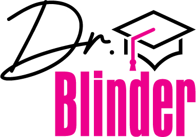
The logo itself features a cursive Dr. In a black font called Innocent. This is perched on the shoulder and slightly offset to the left of a hot pink coloured Blinder text below. The Blinder text is a bold condensed font called Aurora. Beside the Dr I have added a stylised mortar board icon with a sharp black line detail and a hot pink tassel which drops down to meet the bold pink blinder text below.
As discussed, I have tried to combine in this logo a mix of your academic success and your flamboyant personality. The hot pink and black colour scheme reflect this and the juxtaposed font styles compliment the idea. The logo, overall, leads the eye well and has a deliberate asymmetrical appearance to further a concept of non conformity. I took the colour inspiration from your graduation photo.
Blinder Take
What makes this logo special is that I have known the designer since my teen years, so he approached the design in a personal way rather than me contracting it out to somebody. This means a lot, and I do describe myself as a blind non-conforminst!
Back to the Dr Blinder Mikey Hughes Home Page
Last updated 25 September 2022